A user-centred design approach to menstrual-associated mental health

Overview
Challenge
IronHack’s bootcamp challenge was to propose a new mobile app designed to support either the Wellness or the Finance industry. Based on user research, we needed to identify an opportunity for an app to improve people’s day-to-day lives. The only requirement was that it had to track something (e.g. tracking sleep, expenses, food intake, etc.).
Goal
To produce a minimum viable product in the form of a high-fidelity prototype.
My Role
Project roadmap, user research, problem definition, jobs-to-be-done, feature prioritisation, low/mid/high-fidelity prototypes, usability testing, branding and user interface design.
Teammate
Xiomara Guillorme
Timeframe
10 days.
Scope & Constraints
The final design needed to focus on one aspect of either the wellness or the finance industry that we considered important and it had to include a data visualisation.
The Problem
People who menstruate need a way to recognise a pattern in their mood fluctuations associated with recurring hormonal changes because they want to better understand and take care of their mental health.
Our Process
Research
We created a survey and shared it on period-related Facebook groups. The aim of the survey was to explore:
- if menstruating people track their menstrual cycle
- whether they report symptoms that affect their mental health
- if they talk to others about their symptoms
- if people are interested to learn more about a connection between menstruation and mental health.
Within two days we received 47 qualified responses, predominantly from people aged between 35–44 followed by those aged 25–34. The majority of respondents were located in Europe (72%), followed by North America (16.3%). Results showed that:
- 72.3% tracked their menstrual cycle
- 67.1% reported regular periods (between 21–35 days), 29.8% reported irregular periods (less than 21 days and/or more than 35 days).

Symptoms experienced by over 50% of respondents included:
- Tiredness or low energy (83%)
- Food cravings or binge eating (68.1%)
- Lasting irritability or anger that may affect other people (66%)
- Feelings of sadness or despair (61.7%)
- Mood swings or crying often (59.6%)
- Feelings of tension or anxiety (57.4%)

When asked if they had spoken to others about their symptoms, 83% reported speaking to friends or family members whereas 44.7% reported seeking advice from a doctor or medical specialist.

Additionally, we wanted to find out if Premenstrual Dysphoric Disorder (PMDD) was known to participants. PMDD affects 3–8% of menstruating people and is characterised by severe disturbances in mood caused by fluctuations in hormone levels. As it has only been recognised as a clinical mental health condition since 2013, we were curious to discover if people had been informed about it.

Our results indicated that 46.8% of respondents had not heard of PMDD, yet 91.5% were interested to know more about the connection between menstruation and mental health.
While the survey was live, I was able to schedule one user interview. I wanted to gather further qualitative data on experiences with menstruation and mental health symptoms.
During the 20 minute session, I learned about the participant’s decades-long struggle with misdiagnosed polycystic ovary syndrome and endometriosis. This had severely affected her mental health and once a correct diagnosis was made, she was able to appreciate the relationship her symptoms had to her menstrual cycle:
“[It] makes so much sense..I felt relieved that there is a biological mechanism for my problems..I’m not a crazy person!”
While further user interviews would need to be conducted, this interview added to evidence of a gap between menstrual and mental health awareness.
We then identified key insights from our research. In order to synthesize the findings, we created an affinity diagram by clustering related insights into groups so that we could find trends and patterns within the data.
We found that aside from the physical pain caused by menstruation, large groupings of mental affliction were able to be categorised under themes of sadness, irritability and anxiety. We were also able to form a large group of findings under the theme of self-care, as this was a common solution to coping with menstrual symptoms.

Empathy Map & Persona
From the research findings, I created an empathy map while my teammate started to design a persona. By separating the tasks, we were able to discuss and inform each other’s approaches. This allowed time for reflection on our research findings while also challenging each other’s perspectives on how our persona would be represented.

How Might We…?
Although we had the goal of creating a tracking app, we still decided to formulate a ‘how might we’ statement. As we were working towards delivering an MVP, we wanted to frame the problem that our product would ultimately try to solve.
How might we help people who menstruate recognise a pattern in mental health fluctuations associated with recurring hormonal changes?
Although the ‘how might we’ statement is generally used to direct broader product concepts, I found it very helpful to refer back to it as I was writing jobs-to-be-done and prioritising features.
Competitor Analysis
To get a better understanding of the current market for menstrual tracking apps, we researched companies that are solving the same problem we had identified. By comparing the services offered by Clue, Flo and Moody Month, we were able to get an overview of features included in their digital products.
Clue and Flo have a large list of features that also include fertility and pregnancy tracking capabilities. The more recently launched Moody Month app is targeting the mental health market and offers content to address hormonal mood changes.

Jobs To Be Done
While referring to the HMW statement and the competitor analysis, I created job statements. This helped to inform what “job” each features within the app needed to do. From five of the JTBDs and we came up with five related features. A number of other feature ideas were also identified in response to the competitive analysis.
Feature Prioritisation
By dividing feature ideas into quadrants of the MOSCOW matrix, we were able to select and prioritize what needed to be included in the MVP. Three features were identified as must-haves.

Prioritising features in this way allowed us to not only decide what needs to be developed for MVP, but also to recognise which features needed to be developed to allow for probable future developments.
In this case, a predictive mood feature was categorised as a should-have because this feature would make it easier for users to recognise hormonal patterns associated with their cycle. However, it wasn’t necessary to include it in the MVP, yet the feature needed to be considered in the design so that it could be easily introduced in a later version release.
Low-fidelity Prototype
Both my teammate and I took some time to sketch out our separate ideas into low-fidelity wireframes before coming together to discuss.
This provided a quick visual concept to better understand what each team member was thinking and to consider what the purpose of each screen was going to be.
After sharing ideas and discussing how the app could work, we created a final low-fidelity prototype that combined and simplified the most beneficial aspects of each concept.

More Research & User Journey Map
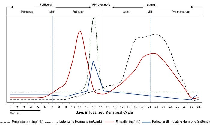
We took some time to research how the menstrual cycle can affect the brain, as we wanted to understand the biology of menstrual cycle-associated mood variations.
We found that there are four phases of the menstrual cycle: menstruation, the follicular phase, ovulation and the luteal phase. During the follicular phase, oestrogen levels rise. It’s often reported that positive emotions are experienced during this phase. During ovulation, when the body releases an egg, feelings of heightened energy are often experienced. The following phase, the luteal phase, sees a sharp decrease in oestrogen and an increase in progesterone. During this phase mood symptoms of irritability, sadness and anxiety are commonly experienced. The symptoms of premenstrual syndrome (PMS) and, its more severe form, Premenstrual Dysphoric Disorder (PMDD) occur during this period.
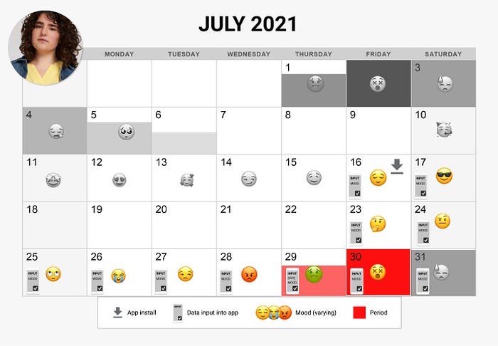
With this information, we were able to create a calendar of the emotions our persona would experience during her cycle. We also included days in which she would interact with the app and input data. We chose to design the task flow from the first two weeks of app use, as this included entering mood and period records.
User Flows
We created task flows for two use cases in the app: recording mood and recording period start date. This illustrated all of the steps necessary to complete the tasks. It’s interesting to see that, from the home screen, both sequences take a circular path to completion.

As there are a number of steps to complete the mood input, I thought the first interaction with the app (after install) was very important for the user to become familiar with the process needed to complete the task. For that reason, emphasis was placed on the design and user testing of the onboarding sequence.
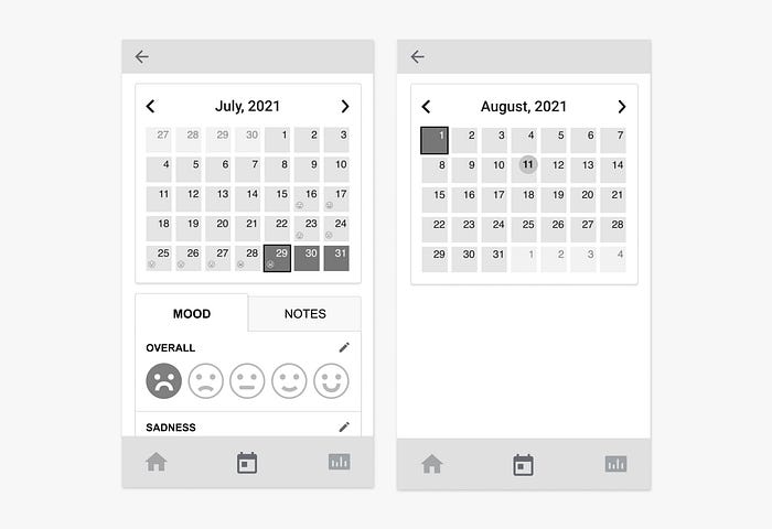
Mid-fidelity Prototypes
We created a mid-fidelity prototype that included an initial onboarding of the mood input sequence before arriving at the home screen.
The app relies on frequent mood inputs from the user in order to track mood fluctuations over the course of a menstrual cycle.

From the home screen, wireframes for entering period dates were designed.

User Testing Results: Round 1
We added an opinion scale directly after the mood input task was completed. As the sequence is centred around the current emotions a person is feeling, we thought asking how the experience itself felt would draw interesting insight.
The sequence reported a neutral to very great response from participants, averaging 5.3 out of 7 on a scale of very bad to very good emotions.
This was a very simple and fast way to gain an overall understanding of how the mood input sequence affected users. Based on this data, we decided that the questions asked and the number of screens was acceptable for an enjoyable path to task completion.

However, there were some problems found with the input mechanisms while attempting to input mood responses within the prototype.
Limitations of the mood slider functionality in the prototype hampered test efforts to properly assess if this method was the best way to input the data. Comments included:
“[The slider] just wasn't comfortable to click 1,2,3,4 and not being able to scroll to it right away.”
“Maybe change the slider to something that you can input your data quicker.”
This feedback did make us question the design of the slider mechanism and its consistency, which was addressed in the next iteration.

We then showed people the home screen design for a moment and then asked if they noticed a connection between their menstrual cycle and their mood. We wanted to test if the overall mood graph positioned below the cycle visualisation was communicating a decrease in positive emotions associated with the person’s current cycle phase.
Only 44% of respondents saw a relationship between their menstrual cycle and their overall mood.

Design Iterations: Round 1
A number of design changes were made in response to the user testing:
1: Adding introduction text
Two new screens were created: the first was to introduce the overall goal of the app. The second was to establish the importance of regular mood recording and to introduce the ‘how are you feeling’ call to action.

2: Changing sliding scales to buttons
We changed two of the mood input methods from sliding scales to buttons. As these were more generalise recordings, we thought the 0–10 scale might be needlessly meticulous.

3: Change to input designs
An advantage of adding the smileys to the mood input sequence was that we could use the recorded smiles on the home screen. We thought that this would clearly show the progression of mood in relation to the menstrual cycle.

4: Changes to slider design
For the three questions that asked about specific emotional intensities (levels of sadness, anxiety and anger), we created an interaction that reveals the number as the user slides. Visually, we thought this will draw attention to the sider button and afford a sliding action.

5: Calendar screens
Further development to the product was the addition of a calendar section. This stored all user inputs over multiple cycles. It would also allow users to edit their mood inputs or to write a text note and see a monthly overview of their moods in relation to their cycle phase.
User Testing Results: Round 2
Another round of user testing was conducted on the second prototype.
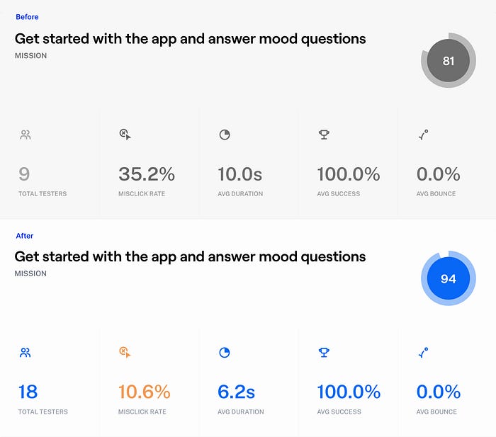
When users were tasked to answer the mood questions in the app, results showed:
- a usability score of 94% (an increase of 13% compared to the first prototype)
- a 24.6% reduction in misclick rate
- users could complete the task 3.8 seconds faster compared to the original prototype.
The task of entering their period date from the home screen continued to show poor results and the larger sample size confirmed that this was a problematic task for users to complete.

When analysing the heatmap, we could see that some people would click on the calendar symbol in the main navigation and within the cycle visualisation area. Although the correct button to press was titled ‘log period’, the surrounding elements of the dashboard were causing confusion.
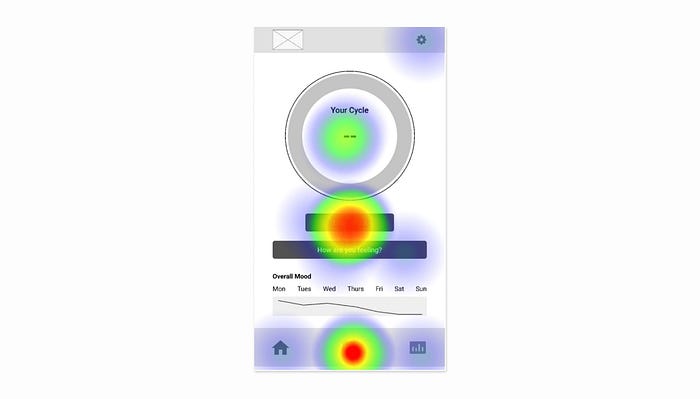
Our effort to improve the visual connection between the user’s menstrual cycle and their mood showed signs of success, with a 27% increase of people answering ‘Yes’ to the corresponding question.

Finally, the task to open the new calendar section in the app proved problematic for users, showing a high misclick rate when trying to complete the task.

We found that finding the new calendar section proved problematic for users, showing a high misclick rate when trying to complete the task.
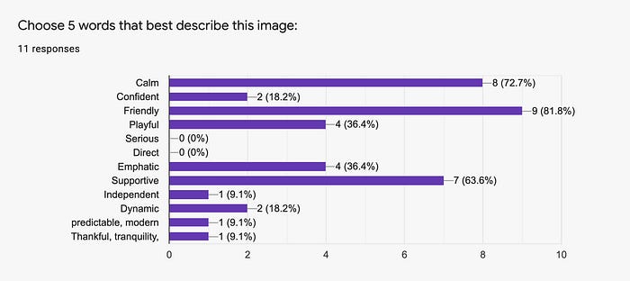
Mood Boards
While I was working on the mid-fidelity design, my teammate worked on the creative direction. Together, we decided on five attributes we thought were appropriate for the brand to communicate. Our chosen attributes were:
- Friendly
- Playful
- Empathic
- Calm
- Supportive
From this, my teammate created three mood boards.
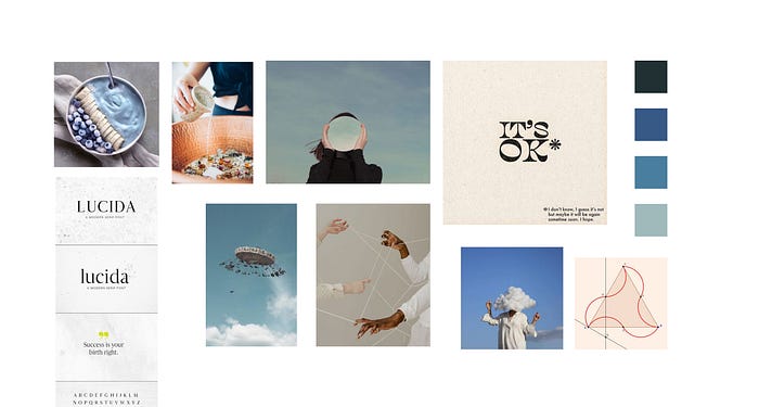
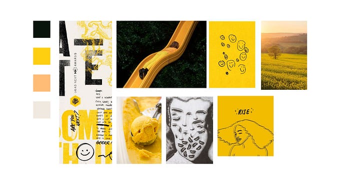
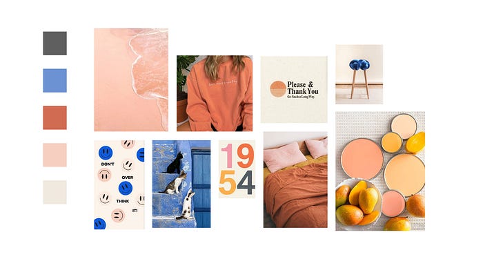
We then tested them in a survey that asked respondents to select 5 words that they thought describe each mood board. The third mood board reported the most responses that matched our chosen attributes.
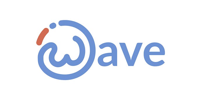
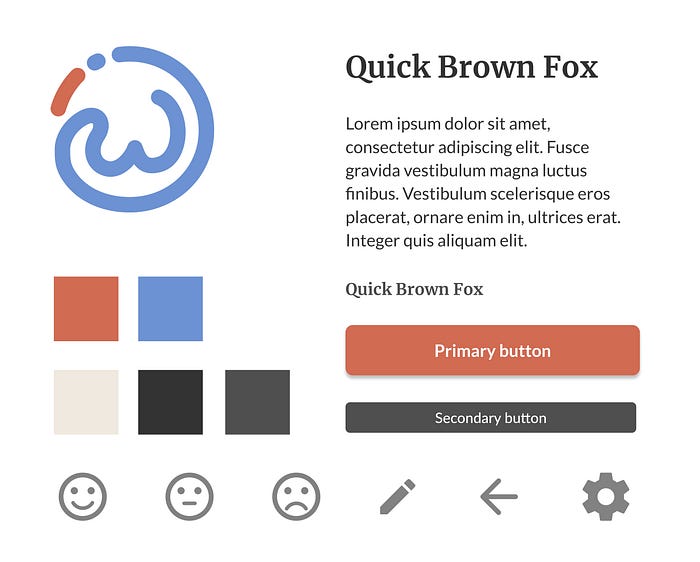
Logo & Style Tile
Using the successful mood board as a guide, we created a style tile that included fonts, colours and interface elements. This allowed us to quickly determine a design direction before starting the hi-fidelity prototype. As part of the style tile, we also decided on a product name and experimented with logo ideas, eventually arriving at a suitable design.
Hi-fidelity Prototype

The final iteration of the design was a high-fidelity prototype that incorporated the branding. The high-fidelity prototype included a number of design changes based on results from the previous mid-fidelity user testing. Design changes included:
1: Positioning the ‘log period’ button inside the cycle visualization
Results from the previous mid-fidelity user tests showed that some users tried clicking within this area when tasked with recording their period start date. Positioning the button here may be more intuitive to users.
2: Adding a key under the cycle visualisation
For an easy reference to what the colours are communicating.

3: Text titles added to navigation buttons
Some users had tried clicking on the calendar symbol when tasked with adding their period start date. To better clarify what the button’s function was, we added titles to all the buttons in the main navigation section. Additionally, we included the product logo as the home screen button for better brand recognition.
4: Automatic date input
Instead of leaving the date input empty, we included the automatic input of today’s date. Based on the assumption that most users would record their period start date on an actual day, this would significantly speed up the time to complete the task.

5: Date input removal
As moods could now be recorded or edited in the calendar section, it was assumed the date input was no longer necessary here.
6: Enhanced smileys
We created a greater distinction between the smiley face expressions. As the addition of smileys had tested well on the mid-fidelity prototype, we wanted to allow for future testing of the perceived emotional state that each smiley communicated to the user.

Final Outcome
Learnings
As we conducted a number of usability tests during this project with a small number of participants, I was curious to find out just how many testers are needed to get valid results. It turns out that there isn’t a simple answer.
Jakob Nielsen from the Nielson Norman Group wrote an article about how many testers are needed in a usability study. He says for qualitative studies 5 users will get close to user testing’s maximum benefit-cost ratio. For quantitative studies, Nielsen says at least 20 users are required to get statistically significant results, although tight confidence intervals (or margin of error) require more users.
SurveyMonkey provides a survey sample size calculator that takes into account population size (or target population), confidence level and margin of error.
So, how many participants will I recruit for my next user study? Answer: it depends.